#Pixel Edge Design Studio
Explore tagged Tumblr posts
Visit Tumblr Blog
Explore Tumblr blogs with no restrictions, modern design and the best experience.
Last Seen Tumblr Blogs


Fun Fact
Tumblr Inc. is funded by 13 investors.
Text
#Pixel Edge Design Studio#about us#animation studio#multimedia solutions#2D animation#3D animation#visual effects#video production#interactive experiences#creative services#India animation studio#animation experts#design studio#brand elevation
0 notes
Text

Create Your Own Main Menu for The Sims 4 - Tutorial
Hey folks!
This tutorial will walk you through creating your own main menu override for The Sims 4 based on my custom repository.
_________
What is required:
JPEXS Free Flash Decompiler
Sims 4 Studio
Raster graphics editor (e.g. Photoshop, Gimp, Photopea)
Your Own Main Menu repository
_________
Step 1: Download and unzip the Your Own Main Menu repository
It's available on my Patreon page for free.
_________
Step 2: Prepare your custom images
There are two images that you need to customize:
SimMattically_YourOwnMainMenu_MainBG.pngThis is the main background image, where you want to put the desired graphic.Size: 1440px x 1200px
SimMattically_YourOwnMainMenu_BarBG.pngThis is the second background for the navigation bar on the right.Size: 480px x 1200px
Prepare your own images based on these templates. Do not change the size of the images.
Tips: If you're using a more complex background, such as a screenshot from your game, I recommend blurring the Bar_BG with a Gaussian Blur (~60px). Additionally, I suggest adding a white overlay with ~50% opacity and a 5-pixel wide white bar on the left edge with ~10% opacity. This helps improve the readability of the navigation bar buttons and adds an extra layer of detail to your menu design.

The repository also contains the optional file "SimMattically_RefreshedMainMenu_ScenarioButton.package" from my other mod, which replaces the Scenario button icon with a semi-transparent white version. It's up to you whether you want to use it.
_________
Step 3: Import the images to the .GFX file
Firstly, open JPEXS Free Flash Decompiler and then open my SimMattically_YourOwnMainMenu_Template.gfx with it.


Select "No to all" when prompted.

On the left, choose "images" and scroll to the bottom where you will see the images you just edited in their original form. Right-click on each and select "Replace." Select the custom images you prepared in step 2.


Save the file.
_________
Step 4: Import the .GFX file into the .package file.
Open Sims 4 Studio, then click on "My Projects" and open SimMattically_YourOwnMainMenu.package. Select "Scale Form GFX" (the one with the "gameentrylauncher" description) and click on "Import." Select the modified .GFX file and import it. On Windows OS, you need to switch from .binary to all file types to see the file.


Save the .package file via File -> Save As... Give it a custom name and place it in The Sims 4/Mods folder.
That's it! Enjoy!
_________
IMPORTANT INFORMATION/TERMS OF USE:
Main menu overrides can become outdated with some game updates, causing them to break the game. You will have to remake your custom main menu with a new, updated template in this case. Always make sure you are using the latest available template and that it's not outdated.
Since these mods can break the game, I do not advise sharing your custom main menus with other players. You are free to do so, but be aware that since you're relying on this repository to create your own version, you most likely won't be able to update the mod and resolve issues for other players on your own, so you take responsibility for breaking their game.
If you decide to share your version with other players, please credit my repository and link to my Patreon post.
Do not put your custom main menu based on this repository behind any paywall or early access. I made this repository and tutorial free for everyone, so keep it fair.
I do not take responsibility for people misusing this repository or breaking your game with incorrectly modified files. I do not provide support for custom main menu overrides created by other creators using this repository.
_________
#sims#thesims#thesims4#sims4#sims 4 mods#sims 4 custom content#simblr#s4cc#ts4#main menu override#sims tutorial
312 notes
·
View notes
Note
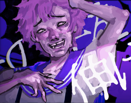
Any advice on drawing dragons? I really wanna ms paintify my boy
Sure! I don't usually draw dragons but I can try :D
LINEART

Here's the design I'm using. It's a character I made for this small tutorial owo
It's essential to use a pixel art brush for the lineart. Usually it's best to leave it black but you can add other colors too if it fits better.
I'd suggest avoiding round edges when possible, and keep the design pointy. This is because mspaint drawings are usually inspired by old anime from the 90-2000s.
I chose a more complex design, but a simpler one works too.
COLOR

As for color, my advice is to use strong colors more than pastel tones. I chose red, grey, black and white mainly because my character is an emo one, but you can use any you want. You can also use plenty of colorful choices to make it vibrant.
Another advice is to choose similar tones as the mspaint colors. Here's a reference:

Something very common in mspaint style is also adding lights to show texture. Choose a lighter tone for it. The brighter it is, the more reflective is the texture (for example in wings). The inside of the wings can have a slight brightness added.
I don't really add shadows but that's an artistic choice so you can add them if it fits your style better :3
BACKGROUND
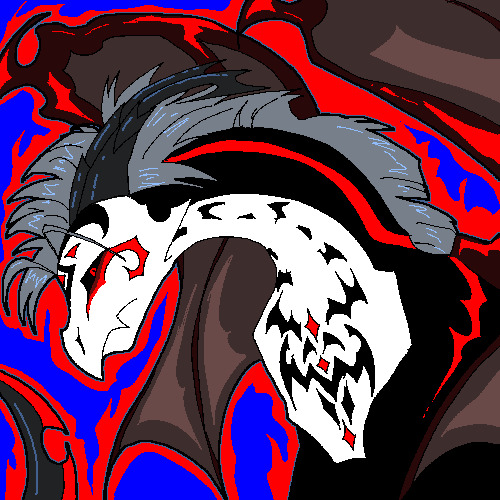
As for the background, most mspaint styles keep it very simple. This is because there is only one single layer in the program. While I did this drawing in Clip Studio Paint and used several layers, it gives the same vibe.
I added some flame details because it's very common in edgy characters. But you can leave it plain or add patterns like stars or circles.
And... I think that's all ^^
Hope it helps!
72 notes
·
View notes
Note
if youre comfortable sharing, whats your rendering process? what are some ways you learned? your art is very yummy
HSHSHHSHS hello!!!!!!!!!! first off omg,,,, thank you so much,,,,🤭🤭
secondly!!!! heres my attempt at a rendering process explanation. uhm. warning ive never really been asked to explain it before please bare with me
BUT. here goes. this'll probably be ungodly long apologies
so when i render my biggest rule is basically Do Not Blend Ever. what i do is do my sketch, then flats, then basic placement of blush/shadows+darkest parts/etc and then i go in and just colourpick the inbetweens+place them between colours in small strokes until the changes in colour don't look too sharp/jarring
here's some examples of the process;;;
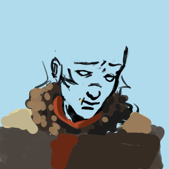
(still a wip but HSHSHHS) so i work on 3 layers primarily (sometimes i do the hair+items that cover the face on another layer, too, though they might end up getting merged):
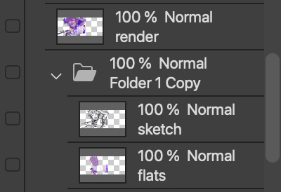
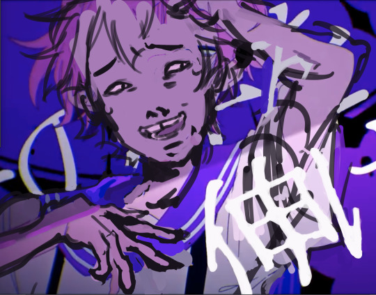
^ with just the sketch layer n flats / and then with the render layer added
i go in with a bigger brush to block in colour variation on the face on the flats layer and then paint over that, as well as over the sketch, with smaller strokes on a render layer- i never do lineart lol, and any "lineart" thats visible is just the sketch peeking through. I try to rely on colour and shadow to create shapes and boundaries instead of lines though this isn’t a hard and fast rule.
i also try to stick to the same pallette the entire drawing- once the flats and shadows are first roughly blocked in all the other tones/midshades/colours are basically just inbetweens picked directly from the drawing. Just me zooming in real close till I can see the pixels and colour picking where they sort of mix. (any smaller shifts in hue/tones are just colours with saturation slightly turned up or down, usually) im also not sure if this helps but i use the Sol brush from the clip studio assets store for literally everything from sketch to render, which is basically just a slightly soft opacity brush which ive deluded myself into thinking helps give my art a softer look. idfk if it does or not.:)
I like to use really saturated blush and for shadows I usually use two base colours; a warmer one and a colder one- a warmer one for smaller shadows and shadows near light and then colder ones for planes more in darkness. Also, usually, at the very end of the drawing I’ll add a layer that’s just fully yellow with colour burn or linear burn or multiply turned on and the opacity turned low just to make everything warmer. (a little thing I like doing for shadows sometimes is never making them reach the edge of the plane; the actual edge is usually a slightly lighter shade and it sort of looks like stylised bounce light that would probably not be there but anyhoo)
but yeah,,,, Never Blend But Make It Look Almost Blended. I’ve been doing it forever,,,,,, and I really like the almost shiny feeling it gives things:)))
And where did I learn. Ough. A lot of what I do I figured out through trial and error and just drawing a bunch (IM SORRY THATS REALLY NOT HELPFUL) but some sources I looked towards were sinix design and bluebiscuits on YouTube!!!!! Sinix has a really good video on rendering skin which is where I sort of took my principles from and ran. And bluebiscuits was a huge inspiration for me when I started trying to render things beyond flats!!!!!!! They’re also where I found the sol brush, lol. Also just,,, the impressionist movement as a whole is a massive inspiration. The use of light and shapes to create form is just,,, omg. Especially Claude Monet in particular. (and for the basics of drawing I learnt from my aunt!)
and honestly, just observing people. A lot of the time when I’m watching a movie or on a walk or even just talking with someone I tend to start looking at their face, and the different planes, how light hits it and how shadow interacts with it, where the shadows are harsher/softer……….people are wild man
I really hope that made sense!!!!!! I’ve never tried explaining it before and honestly, I’m not even really sure how I do it. I just sorta. Switch off and start drawing, yk? BUT I HOPE IT HELPED!!!!🫶🫶💞💖
in case that was all utter nonsense here’s a speedpaint that’ll hopefully demonstrate my process;;
I also have straight up screen recordings of me drawing but. I don’t think anyone wants to sit though that
thank you for the ask!!!!!have a nice day/night and SORRY THAT ENDED UP THAT LONG
7 notes
·
View notes
Text
Unveiling Ahmedabad's Finest: The Best Digital Marketing Agencies
In the bustling cityscape of Ahmedabad, where tradition meets modernity, businesses are thriving amidst a competitive landscape. In such a dynamic environment, the significance of digital marketing cannot be overstated. As businesses seek to expand their reach and solidify their online presence, the role of a proficient digital marketing agency becomes indispensable. Let’s take a closer look at some of the premier digital marketing agencies in Ahmedabad that are spearheading innovative strategies and driving tangible results for their clients.
Digital Upstarts: As one of the leading Best Digital Marketing Agency in Ahmedabad, Digital Upstarts has earned a stellar reputation for its comprehensive suite of services tailored to meet the unique needs of each client. From search engine optimization (SEO) and social media marketing to content creation and pay-per-click (PPC) advertising, they offer a holistic approach to digital marketing that ensures maximum visibility and engagement for businesses across various industries.
Pixel Studios: With a creative flair and a strategic mindset, Pixel Studios has emerged as a powerhouse in the realm of digital marketing. Specializing in web design, branding, and digital strategy, they have helped numerous businesses carve out a distinctive identity in the digital sphere. Their innovative campaigns and visually captivating content have captivated audiences and generated impressive ROI for their clients.
Digimark: Renowned for its data-driven approach and analytical prowess, Digimark stands out as a top-tier digital marketing agency in Ahmedabad. Leveraging cutting-edge tools and technologies, they delve deep into market insights and consumer behavior to craft targeted campaigns that deliver measurable results. Whether it’s optimizing conversion rates or enhancing brand visibility, Digimark excels in driving growth and fostering long-term success for its clients.
Digital Dynamo: True to its name, Digital Dynamo is a force to be reckoned with in the digital marketing landscape of Ahmedabad. With a team of seasoned experts and industry veterans, they offer a diverse range of services encompassing SEO, social media management, email marketing, and more. Their strategic approach, coupled with a relentless focus on innovation, has propelled numerous businesses to new heights of success in the digital realm.
Web Wizards: Combining technical expertise with creative brilliance, Web Wizards has carved a niche for itself as a premier digital marketing agency in Ahmedabad. From designing visually stunning websites to devising targeted digital campaigns, they excel in helping businesses amplify their online presence and drive meaningful engagement with their target audience. With a client-centric approach and a passion for excellence, Web Wizards continues to set the benchmark for digital marketing excellence in Ahmedabad.
In conclusion, the vibrant city of Ahmedabad is home to a diverse array of digital marketing agencies, each bringing its own unique strengths and capabilities to the table. Whether it’s crafting compelling content, optimizing online visibility, or driving lead generation, these agencies play a pivotal role in empowering businesses to thrive in the digital age. By harnessing the expertise of these top-tier agencies, businesses in Ahmedabad can unlock new opportunities for growth and stay ahead of the curve in an ever-evolving digital landscape.
4 notes
·
View notes
Text
Developer Research Part 2: Dynamic Pixels
This studio is the one behind Hello Neighbor, an infamous horror (?) puzzle game from the golden age of mascot horror. (Mascot horror is a relatively new genre, referring to derivative walking simulators that focus more on recognizable characters than horror). While the game has been rightfully savaged, it would be fair to say that throughout its long development cycle, it retained a very interesting aesthetic. In the first few Alpha builds, the game looked vaguely realistic, though it retained an edge of wackiness to it.
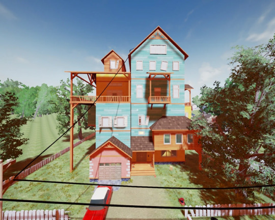
As you can see, even in Alpha 1, a point in development people point to as being more grounded, the house has multiple decks, balconies and floors essentially stacked on top of each other. I jokingly referred to this crooked architectural style as the 2fort-Yharnam Spectrum, and the vibrant colours definitely make it stand out. Beyond that, though, there's another angle to the strangeness of it. The windows are slightly crooked, and there's a train going through the house.

Beyond being there just to add to the nonsensical architecture, the train immediately acts as a sort of lure for players - not only is it something to strive for, getting to the top floors of the house and riding the train (albeit something you can't do in this build), it is a moving component and makes the level more interesting. Of course, on a primal level, the human eye is designed to lock onto movement, but moving components, at least in my opinion, make a level seem so much more alive and real. Even looking back to my early research with Kingpin and Half Life 2, there's always some flickering screen or rusty wind turbine adding a tiny bit of motion to an otherwise still screen. But, back to Hello Neighbor. As Alphas evolved into Betas, the art style essentially extrapolated, shedding the more realistic elements and leaning harder into the surreal.

I'm not a massive fan of the new Seussian look everything has; some of it looks good, but most of it is garish, over-the-top, and does not inspire an atmosphere of horror in the slightest. What I do think is interesting, however, is the look of the machinery around the neighbor's house.
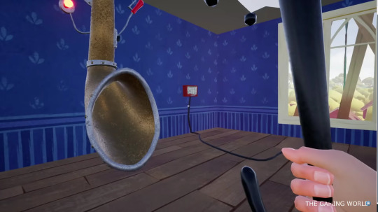

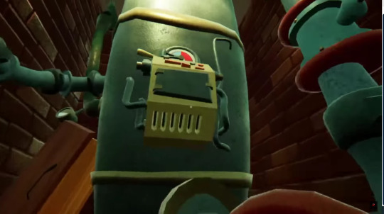

Everything appears wacky and cobbled together, covered in levers and gears and valves and gauges and rivets. There's an interesting focus on brass, giving the whole thing a pseudo-steampunk vibe. It is definitely in line with my aesthetic for Sinister Workshop. However, it's clear through watching various video essays that people didn't like the overly vibrant later Betas. That's fine, since I planned for my game to be considerably gloomier, while retaining the strange machinery aspect I have borrowed from Hello Neighbor.
Edit: Dynamic Pixels' other work is on tamagochi-esque mobile games, such as the MewSim series. It's not too relevant, just vector art-esque designs, very simplistic and not too interesting either. It's not like HawkSandwich where there's a definite vibe in all their work, Hello Neighbor seems like a one-off.
2 notes
·
View notes
Text
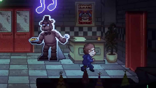
"Into the Pit": Revealing the Horror - A Novel Chapter in the FNAF Chronicles
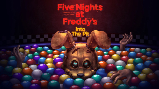
Since its launch, the Five Nights at Freddy's (FNAF) brand has given players chills, and it doesn't seem to be slowing down. "Into the Pit," the newest instalment in the series, transports viewers further into the horrific realm of nightmare riddles and mechanical creatures.
Exploring the Abyss:
Released as a new chapter in the ongoing development of the FNAF universe, "Into the Pit" presents players with a whole new set of terrifying puzzles and challenges. This chapter, created by Steel Wool Studios and Scott Cawthon, takes players into the most sinister parts of Freddy Fazbear's universe and promises to be an exhilarating and terrifying ride.
An Enthralling Story:

The captivating story at the center of "Into the Pit" is what keeps players on the edge of their seats. The protagonist of the game finds himself in an altered and horrifying version of the FNAF universe after falling into a mysterious hole. Players must solve puzzles, face fresh animatronic nightmares, and find the secrets concealed in the shadows as they make their way through this warped reality.
Creative Gameplay:

By introducing novel gaming concepts, "Into the Pit" expands on the groundwork set by its predecessors and elevates the FNAF experience to a higher level. In order to survive the night, players must use strategic thinking and fast thinking. Understanding the mechanics is essential to remain one step ahead of the unrelenting creatures that lurk in the shadows because every animatronic has a distinct set of characteristics.
Visuals and Ambience:
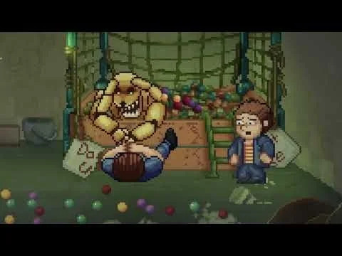
The visual abilities of "Into the Pit" are very astounding. The game's breathtaking visuals transport players to an eerie, atmospheric setting. Every element, from gloomy hallways to unsettling animatronic designs, has been painstakingly created to arouse feelings of anxiety and expectation. The sound design is a fantastic match for the graphics, producing a spooky atmosphere that makes players look over their shoulders.
Fan Theories and Easter Eggs:

In keeping with FNAF custom, "Into the Pit" is full of hidden clues and Easter eggs that entice players to learn more about the game's history. Fan theories about the game's hidden links are already rife in the community, with members analyzing every element. Fans continue to theorize about Scott Cawthon's rich storytelling even after the initial release, which enhances the FNAF experience.
In summary:

"Into the Pit" is an immersive trip into the core of terror rather than merely a game. It is proof of the FNAF franchise's ongoing appeal thanks to its captivating story, inventive gameplay, and evocative design. One thing is certain: the terror that began in Freddy Fazbear's Pizza is far from done as players prepare for the next round of animatronic nightmares. Prepare to be enthralled, terrified, and enthralled as you go straight into the terrifying experience.
3 notes
·
View notes
Text
Advantages of small-pitch LED background wall
What is a small pitch LED background wall?
Small-pitch LED display screens refer to screens with pixel spacing ≤2.5mm, suitable for indoor scenes that are viewed close-up, such as conference rooms, command centers, studios, etc. Its ultra-high resolution and delicate display effect subvert traditional large-screen technology.

Five core advantages
Seamless splicing, complete picture
The traditional LCD splicing walls are split due to gaps. Small-pitch LEDs are seamlessly spliced through precision design, presenting a picture as smooth as a whole piece of glass, which is especially suitable for displaying fine content such as maps and data. What is a fine pitch LED display?
Ultra HD display, clear details
The small-pitch LED pixel density is high. Taking P1.5 as an example, it exceeds 440,000 pixels per square meter and supports 4K/8K display. Even if you watch it up close, the picture is still delicate and grainy, suitable for high-demand scenes such as command centers and studios.
High-brightness and high-gray to adapt to multiple scenarios
The brightness of the small-pitch LED can be automatically adjusted to adapt to bright environments, while maintaining excellent grayscale at low brightness, bright colors and rich layers. Through point-by-point correction technology, the screen is still stable for a long time, which is better than the dark edge problem of LCD. Which screen is better for your eyes: LED or LCD?
High refresh rate, smooth and flicker-free
The refresh rate is as high as 3840Hz or above, the dynamic video has no flickering, no ripple, and clear edges. Whether it is a stage performance or a live broadcast, it can bring a smooth visual experience, making the audience's eyes more comfortable.

Energy saving and longevity, economic and environmental protection
The LED screen has a lifespan of over 100,000 hours, low energy consumption and more cost-effective operation. Market research shows that the global LED display market is expected to reach US$23.3 billion in 2030, and energy-saving characteristics are the key to its popularity (data source: Market Research Report). Are LED billboards expensive? How high is the operating cost?
Application scenarios
Command Center: High resolution supports multi-signal access to meet power, military, transportation and other needs.
Meetings and education: Improve communication efficiency, suitable for corporate conference rooms and classrooms.
Commercial entertainment: Shopping malls, cinemas, etc. use gorgeous pictures to attract attention. There are price ranges for commercial LED displays here.
Radio and Television Show: Supports XR virtual show and naked-eye 3D to create an immersive experience.

Future trends
The global LED display market size in 2022 will reach 51.436 billion yuan, and is expected to increase to 75.905 billion yuan in 2028, with an annual compound growth rate of 6.57% (data source: industry report). Small-pitch LEDs are expanding from professional fields to commercial and civilian markets. COB packaging technology improves stability and protection, and combined with VR/AR will create a more immersive experience. COB LED display: Explore novel display technologies.
Purchase suggestions
Matching requirements: Select P1.8-P2.5 in the conference room, and select P1.2 below for the command center.
Maintenance cost: Choose modular design brands, such as Lianjian Optoelectronics and Zhouming Technology.
Signal compatibility: Ensure support for multi-signal input and seamless connection with existing equipment.
Summarize
The small-pitch LED background wall has become the first choice for indoor display with its advantages of seamless splicing, ultra-high-definition display, high refresh rate, energy saving and longevity. Whether it is a professional command center or a business scenario, it can light up the space.
Thank you for watching. I hope we can solve your problems. Sostron is a professional LED display manufacturer. We provide all kinds of displays, display leasing and display solutions around the world. If you want to know: Transparent LED billboard, understand its pros and cons in one article. Please click read.
Follow me! Take you to know more about led display knowledge.
Contact us on WhatsApp:https://api.whatsapp.com/send?phone=+8613510652873&text=Hello
0 notes
Text
The Silent Struggle Behind Android OS: Freedom, and the Code That Binds Us
In the glittering world of mobile technology, about android OS -Android OS stands as a paradox—both a symbol of liberation and a battlefield of complexity. Behind its colorful interface and seemingly effortless usability lies a storm of fragmentation, security debates, development dilemmas, and user fatigue. This is not just an operating system—it is a philosophy, an ecosystem, and at times, a technological suffering masked by sleek design.
The Birth of an Open Dream
Android OS was born from idealism. Created by Android Inc. and acquired by Google in 2005, it aimed to provide a free, open-source operating system for mobile devices. On paper, it was freedom. In reality, freedom comes at a cost. The open nature of Android, though revolutionary, led to fragmentation—a term that developers dread and users don’t even realize they're victims of.
Unlike Apple’s iOS, which is tightly controlled, Android OS lives in chaos. Every manufacturer, from Samsung to Xiaomi, adds its own layer of customization. What should be a unified experience becomes a maze of interfaces, settings, and updates. The suffering begins not with bugs, but with inconsistency.
Fragmentation: The Curse of Freedom
One of the most persistent issues with Android OS is version fragmentation. While Google may release Android 14 with cutting-edge features, most users are stuck on Android 11 or 12. Device manufacturers delay updates, carriers restrict rollouts, and budget phones are left behind.
This fragmentation results in:
Security vulnerabilities
Developer nightmares
Inconsistent user experiences
Imagine a developer trying to build an app that works flawlessly on every Android version, screen size, and device manufacturer’s skin. It’s not development—it’s a warzone. The same code behaves differently on a Samsung Galaxy than it does on a OnePlus or a Pixel. The Android SDK is rich, but its implementation suffers from ambiguity.
The Custom ROM Renaissance: Hope or Despair?
For many power users, the answer to Android OS's inconsistency lies in custom ROMs. These community-built versions of Android, like LineageOS, Pixel Experience, and crDroid, promise a cleaner, bloat-free, and frequently updated OS.
But flashing a ROM isn’t easy. It demands:
Unlocking bootloaders
Wiping data
Navigating XDA threads filled with jargon
And often, it ends in a bricked device or a half-functional phone. Custom ROMs represent the hacker’s hope, but they are also a reminder of the suffering required for perfection in an imperfect world.
Security: Open Doors and Broken Locks
Security on Android OS is a double-edged sword. On one hand, Google Play Protect and monthly security patches offer decent protection. On the other, the Play Store is still occasionally flooded with malware-laced apps, spyware, and data mining tools disguised as innocent utilities.
And for users who venture outside the Play Store to sideload apps, the risks amplify. Malware like Joker and Triada exploit the very openness that defines Android.
This is the cruel irony of the Android OS: the freedom to install anything becomes the freedom to compromise everything. Security becomes a matter of personal responsibility, which most average users are ill-equipped to handle.
Developer’s Despair: Code Once, Debug Forever
Developing for Android isn’t just a career—it’s a trial by fire. The platform encourages innovation but demands constant adaptation. An app that works on Android 9 may crash on Android 13 due to deprecated APIs, new permissions models, or background process restrictions.
Tools like Android Studio, Jetpack Compose, and Kotlin try to make development smoother. But the underlying OS complexity turns every build into a gamble.
Developers often suffer from:
Endless compatibility testing
UI bugs due to device-specific issues
Battery optimization conflicts
Strict Play Store policies
Each update feels like treading on landmines. The suffering isn’t in writing code—it’s in making it work across the chaotic universe Android OS inhabits.
The OEM War: Bloatware, Ads, and Manipulation
Most Android users never experience “pure Android.” Instead, they get heavily modified skins like MIUI, One UI, ColorOS, or FuntouchOS—each trying to differentiate but often adding bloatware, unnecessary features, or even ads in system apps.
This user exploitation represents a deep philosophical corruption. Android was meant to liberate. Instead, OEMs have commercialized the user experience, embedding trackers, replacing default apps with affiliate versions, and prioritizing revenue over usability.
The user suffers unknowingly, tapping on what seems like a game only to be bombarded by ads, privacy invasions, and battery drain.
Digital Balance or Digital Burnout?
With the Android OS powering billions of devices, it shapes how people live, work, and think. The Digital Wellbeing initiative by Google was supposed to address this. But the irony remains: the same OS that tries to reduce screen time is designed to keep users engaged with infinite scrolling, constant notifications, and addictive app loops.
Behind the OS's logic is a battlefield of attention economy algorithms. The freedom of Android becomes a prison of choice—thousands of apps, endless customization, infinite distractions. For the mindful user, this is mental suffering cloaked in pixels.
Conclusion: The Beautiful Struggle of Android OS
Android OS is not just an operating system—it’s a canvas for creativity, a playground for hackers, and a minefield for developers and users alike. Its open-source roots inspire innovation but breed chaos. It offers freedom, but at the cost of control and consistency.
In a world obsessed with clean design and minimalism, Android OS remains a messy masterpiece—glorious in its imperfection, suffering from its success, and yet, still evolving.
As users, developers, and dreamers, we continue to engage with it—not because it's perfect, but because it's alive, raw, and real.
Meta Description (SEO): Explore the chaotic beauty of Android OS. From fragmentation to freedom, uncover the hidden struggles behind the world's most popular mobile operating system.
0 notes
Text
#Pixel Edge Design Studio#animation#multimedia solutions#2D animation#3D animation#visual effects#website design#video production#interactive experiences#animation studio India#creative services#digital storytelling#brand elevation
0 notes
Text
Top Expensive Office Chairs From Premium Brands in 2025
In today’s fast-evolving workspace, where comfort and productivity are interlinked, investing in a premium office chair is no longer a luxury—it’s a necessity. As remote work, hybrid offices, and long work hours become the norm, the demand for ergonomically advanced, stylish, and durable seating solutions has soared. In 2025, premium office chairs are not only designed for support but are engineered with cutting-edge technology, sustainable materials, and aesthetic brilliance.
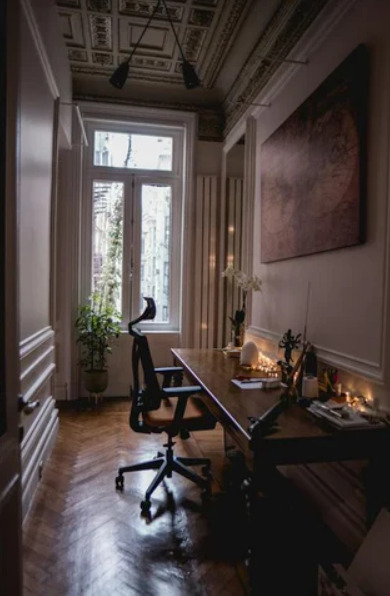
For those seeking the pinnacle of seating luxury and functionality, we've curated a comprehensive guide to the top expensive office chairs from premium brands in 2025. This guide explores design intricacies, material innovation, and what makes each of these chairs command a high price.
To explore the full list and insights, visit the original article on Klekktic.
Why Do Premium Office Chairs Cost So Much?
Premium office chairs come with a hefty price tag, often ranging from $1,000 to over $10,000, and here’s why:
Advanced Ergonomics: These chairs support long hours of sitting with features like lumbar support, seat depth adjustment, tilt mechanisms, and more.
Material Quality: Premium leather, breathable mesh, sustainable woods, and high-grade aluminum or carbon fiber frames are used.
Craftsmanship: Many are handcrafted or assembled with high precision, ensuring superior finish and longevity.
Smart Technology: Integration of sensors, posture feedback, and climate control systems is a growing trend in 2025.
Brand Legacy: Top-tier brands like Herman Miller, Vitra, and Okamura have a longstanding reputation for excellence in design and innovation.
Top Expensive Office Chairs From Premium Brands in 2025
1. Herman Miller x Logitech G Vantum Chair – $1,495
The collaboration between Herman Miller and Logitech G has once again made waves in 2025. The Vantum Chair merges ergonomic brilliance with gaming-centric enhancements for professionals who spend long hours both working and gaming.
Features:
PostureFit spinal support
High-performance suspension mesh
Forward-leaning functionality for alert postures
Designed for professional gamers and coders
Why It’s Premium: Its ergonomic precision and hybrid functionality make it ideal for 12+ hour usage without fatigue.
2. Herman Miller Embody Chair (2025 Enhanced Model) – $2,195
An icon reimagined, the 2025 version of the Embody Chair comes with adaptive pressure mapping and sustainable fabric made from ocean plastics.
Features:
Pixelated Support™ technology
Dynamic seat matrix for pressure distribution
Cooling foam technology
AI-powered posture correction module
Why It’s Premium: Developed with neuroscientists and physicians, the Embody ensures circulation, support, and balance like no other.
3. Vitra Grand Executive Highback Chair – $3,450
For executives who want understated luxury, the Vitra Grand Executive is a perfect blend of craftsmanship and comfort.
Features:
Integrated FlowMotion mechanism
Premium leather finish
Polished aluminum base
Adjustable seat depth and lumbar support
Why It’s Premium: Swiss engineering meets classic design, offering timeless appeal and durability for C-suite offices.
4. Okamura Contessa II Seconda – $2,700
The Contessa II remains Okamura’s flagship model in 2025, used extensively in top tech and financial firms globally.
Features:
Synchro-reclining mechanism
Flexible mesh backrest and seat
Smart operation lever for all adjustments
Minimalist, tech-friendly aesthetic
Why It’s Premium: Japanese precision engineering ensures fluid movement, silent mechanics, and a truly responsive sitting experience.
5. RH New Logic 220 – $2,300
Swedish ergonomics take center stage with the RH New Logic 220, designed for 24/7 intensive use in control rooms and creative studios.
Features:
Tilt mechanism optimized for dynamic sitting
Fully adjustable neck rest, back height, and seat depth
Sustainable construction materials
Customizable armrest functionality
Why It’s Premium: Endorsed for healthcare and mission-critical environments, it’s one of the most health-focused chairs in 2025.
6. Wilkhahn ON® Chair – $3,200
The Wilkhahn ON® Chair leads the charge in kinetic seating—allowing the body to move naturally even while seated.
Features:
Patented Trimension® technology for 3D movement
High-resilience seat foam
Syncro-adjustments with full mobility
Award-winning design aesthetic
Why It’s Premium: It’s engineered not just for support, but movement, improving back health and productivity dramatically.
7. Humanscale Freedom Headrest Chair – $1,650
A top contender in ergonomic luxury, the Freedom Chair offers weight-sensitive recline and synchronously adjustable armrests.
Features:
Self-adjusting recline
Gel seat cushions
Dynamic headrest movement
Eco-friendly manufacturing process
Why It’s Premium: Preferred by architects and lawyers for its comfort and sleek design, it’s the intelligent chair for creative professionals.
8. Steelcase Gesture Chair – $1,995
Adaptable, intelligent, and made for modern digital interactions, the Gesture Chair has set a new benchmark in posture responsiveness.
Features:
360-degree armrest rotation
LiveBack® technology for spine mirroring
Adjustable seat depth and flexible edges
Digital-device friendly ergonomics
Why It’s Premium: Designed after studying thousands of users globally, it conforms seamlessly to how people sit with gadgets today.
9. X-Chair X-Tech Executive Chair – $2,800
A chair packed with tech, luxury, and health features, the X-Tech Executive Chair boasts a built-in massage system and cooling technology.
Features:
Dynamic Variable Lumbar support (DVL)
Heating and cooling seat
ELEMAX massage and therapy units
Memory foam comfort layering
Why It’s Premium: Combining wellness with luxury, it’s a favorite among CEOs and entrepreneurs who work from home.
10. Aeron Remastered – Limited Edition by Herman Miller – $3,995
The Aeron Remastered Limited Edition has been updated for 2025 with aerospace-grade components and limited-run color palettes.
Features:
8Z Pellicle mesh for zone-specific pressure relief
PostureFit SL for lumbar precision
Fully recyclable materials
Custom-configured armrests and finishes
Why It’s Premium: The Aeron is a legacy model, and this special edition cements its place as a functional art piece in modern office culture.
Honorable Mentions
While the list above highlights the most luxurious and expensive chairs, several models deserve an honorary mention for their innovation:
Håg Capisco Puls 8010 – $1,450: Ideal for dynamic and sit-stand workstations.
Cosm by Herman Miller – $1,895: Known for instant ergonomic response.
Secretlab TITAN Evo 2025 – $1,099 (Special Upholstery): A gaming-office hybrid with elite design.
What to Consider Before Buying an Expensive Office Chair
Before making a premium purchase, consider the following:
Ergonomic Fit: Does the chair accommodate your body size and posture style?
Work Style Compatibility: If you’re using multiple monitors or working long hours, features like headrests and lumbar support are critical.
Adjustability: Look for chairs that adjust in height, tilt, armrest, and seat depth.
Aesthetic Harmony: A chair should blend into your workspace or home office seamlessly.
Warranty and Support: Top brands often offer 10–12 year warranties, adding long-term value.
Sustainability in Premium Office Chairs
2025 sees a growing emphasis on sustainable materials and eco-conscious manufacturing. Many of the brands listed above are using:
Recycled ocean plastics
Greenguard-certified materials
Eco-packaging
Modular parts for easy repairs
Brands like Herman Miller, Steelcase, and Humanscale are leading this charge, ensuring high-end doesn’t mean high-waste.
Conclusion
Premium office chairs in 2025 are more than just status symbols—they are productivity tools, health investments, and reflections of personal or organizational values. Whether you’re a C-suite executive, a remote creative professional, or a startup founder, investing in the right office chair can transform how you work and feel throughout the day.
Each chair in this guide brings a unique combination of ergonomics, technology, and design. They serve as long-term investments in comfort and efficiency, tailored to meet the demands of the modern work environment.
To explore more or get a closer look at these top-tier chairs, check out the complete guide on Klekktic's blog.
Frequently Asked Questions (FAQs)
1. Are expensive office chairs worth it? Yes, premium office chairs offer ergonomic support, durability, and features that help reduce back pain, fatigue, and long-term posture problems.
2. How long do premium office chairs last? With proper care, high-end chairs can last 10–15 years or more, especially when backed by long warranties.
3. What is the most expensive office chair in 2025? The Herman Miller Aeron Remastered Limited Edition and Vitra Grand Executive are among the most expensive, reaching nearly $4,000.
4. Which brand is the best for office chairs? Top brands include Herman Miller, Steelcase, Vitra, Humanscale, and Okamura.
5. Can I customize premium chairs? Yes, many premium brands offer customization in upholstery, finishes, base materials, and accessories.
6. Are these chairs suitable for remote work? Absolutely. Most high-end chairs are designed with remote work in mind, especially those that support all-day sitting and digital-device use.
7. Do premium chairs require maintenance? Minimal maintenance is needed, but occasional cleaning, bolt tightening, and checking moving parts is advisable.
8. What should I prioritize—design or ergonomics? While aesthetics are important, ergonomics should always be the top priority when choosing a chair for work.
9. Are there financing options for high-end office chairs? Yes, many retailers and brands offer installment plans, especially for purchases over $1,000.
10. Where can I find the complete list of top office chairs in 2025? You can find the full detailed guide on Klekktic’s blog here.
0 notes
Text
City setting and inspirations
Katana Zero
youtube
Style: Sports a neon-drenched pixel art style with dynamic lighting and relaxed rain effects. Why it works: It captures the gritty, filled with debauchery atmosphere of urban nightlife with its vibrant colors and smooth animations that only highlight the immoral nature of the night time in the city. As our character also does immoral things we could say that the player needs to connect with the story to fully immerse themselves into the game.
Reference: https://moewalls.com/pixel-art/city-at-night-katana-zero-pixel-live-wallpaper

The Last Night
youtube
Style: Cinematic pixel art style with with a rich blend of 2D and 3D elements, showcasing a futuristic urban city. Why it works: Offers a cramped, immersive environment in a bustling city with beautiful dynamic lighting, flashing lights and depth. There is a noticeable emphasis on lighting effects such as ambient occlusion and
Reference: https://store.steampowered.com/app/612400/The_Last_Night/
Night in the Woods
youtube
Style: Stylized, minimalist and cartoonish 2D art with a main focus on small-town settings under the night sky and bright sunsets, evoking nostalgia in its players. Why it works: Conveys a sense of nostalgia and introspection through its use of color and lighting, as well as its concepts. This is also helped by the story involving a feline character going back to their hometown. The game also uses colors with naming of characters and use of gothic prose.
Reference: https://youtu.be/kdUew1TIQU8
https://www.wired.com/2017/03/night-in-the-woods-malaise
Tokyo 42
youtube
Style: Isometric pixel art with vibrant colors and intricate, arguably futuristic city designs in a sci-fi setting it is also quite simple with the design and colors on the sides of the buildings, which helps the player to focus on the well crafted, visually appealing details on the top of the buildings and where it is actually walkable. Naturally however, in this Tokyo areas where you can walk will always have a nice design which its critics have praised. Why it works: Presents a detailed and lively cityscape with a unique perspective that allows the player to focus on the environment in the city as they go to their objective.
Reference: https://arstechnica.com/gaming/2017/05/tokyo-42-review/
Valenberg's Pixel Art


Style: High-detail pixel art animations and drawings inspired by cyberpunk aesthetics with a focus on neon coloring, flashing lights and constant noise with occasional unique drawings and mystery. Why it works: Captures the essence of futuristic and modern city life at night with dynamic scenes and lighting with undertones of depression, dystopia and rapid progression that evokes feelings such as sadness and despair that just as quickly as they come, fleet.
Reference: Valenberg https://www.deviantart.com/valenberg/gallery/48386669/featured
Genesis Noir
youtube
Style: Monochromatic art with abstract representations of urban environments. Unique story and gameplay assisting its unique art style. Why it works: Blends noir themes with cosmic elements to create a surreal cityscape and constant edge of your seat experience as well as keeping a constant sense of mystery.
Reference: https://storiesatworldsend.com/genesis-noir
Signalis
youtube
Style: Retro and anime inspired pixel art with a focus on atmospheric environments. Contains detailed animations and effects are included such as electrical distortion which reflect the character being a robot. Why it works: The game depicts a dystopian, strange setting with moody, dark lighting featuring colors such as yellow for caution, danger and green for elements such as disease and unhealthiness. It has detailed interiors and a visually appealing, realistic shadow system.
Reference: https://youtu.be/xZcMzpVKkLA
Whisper of the Heart (Studio Ghibli)

Style: Hand-drawn animation capturing the serenity of suburban Tokyo at night of suburban Tokyo both at night and day. Why it works: It offers a realistic yet romanticized view of modern city life after dark which holds up even today in evoking emotions such as nostalgia in the watcher.
Reference: https://japancultureguide.com/spots/207
Night City Pixel Art Collections
Style: Various artists' interpretations of nighttime cityscapes in pixel art. A mix of neon, realistic and minimalistic portrayals which allow for creativity to ensue and ideas to be created. Why it works: Provides a wide range of styles and moods for inspiration which can help the watcher in creating a background for a 2D pixel art drawing, maybe even a game.
Reference: https://www.pinterest.com/ideas/night-city-pixel-art/918608556284


0 notes
Text
Top Hybrid App Development Companies to Watch in 2025

In today’s fast-evolving digital landscape, businesses are demanding high-performance, cross-platform solutions that accelerate innovation—especially in Hybrid App Development Companies. As organizations push toward immersive, interactive, and scalable experiences, the demand for a reliable Hybrid App Development Company has skyrocketed. Hybrid apps offer a cost-effective and time-saving alternative to native apps, making them an ideal choice for startups, enterprises, and future-focused ventures alike.
Whether you are a startup looking for rapid prototyping or an enterprise seeking custom Hybrid App Development Services, choosing the right partner can be a game-changer. Here’s a look at the top Hybrid App Development Companies in 2025 that are delivering innovative, robust, and user-focused solutions across industries.
1. Smart App Solutions (India)
Based in India, Smart App Solutions has become a go-to Hybrid App Development Company in India, offering end-to-end services for startups and enterprises. Known for its intuitive UI/UX design, blockchain integration, and Metaverse-ready builds, the company offers scalable Hybrid App Development Solutions tailored to business needs. They also provide flexible engagement models if you want to Hire Hybrid App Development Developer for specific phases of your project.
2. AppsterX Global
A global brand with development centers in the USA, UK, and India, AppsterX Global stands out for its speed and efficiency. Their team excels in delivering cross-platform apps using Flutter and React Native, and their experts in keeping Hybrid App Development Solutions Cost optimized. Their transparent pricing models and agile methodology make them a preferred Hybrid App Development Solutions Company for enterprise-grade applications.
3. CodeWave Technologies
With a portfolio that spans healthcare, fintech, and eCommerce, CodeWave Technologies delivers reliable Hybrid App Development Service globally. Their apps are known for smooth performance, native-like UI, and seamless backend integration. They place a strong emphasis on security and scalability, which is critical for businesses in regulated industries.
4. Pixel Logic Studios
Pixel Logic Studios blends creativity with cutting-edge technology. They focus heavily on immersive technologies and offer hybrid app solutions that support AR/VR and Metaverse functionalities. If you’re looking to integrate real-time 3D environments and blockchain wallets into your app, this is the team to talk to.
5. NexaCode (India & UAE)
NexaCode provides high-quality hybrid apps for businesses in the Middle East and Asia. Their developers are skilled in Ionic and Flutter frameworks, and they provide dedicated teams to clients who want to Hire Hybrid App Development Developer without the overhead of full-time hires. Their transparent project tracking and competitive Hybrid App Development Solutions Cost structure make them a budget-friendly option.
Book an Appointment
How to Choose the Right Hybrid App Development Partner?
Here are a few criteria you should consider while evaluating a Hybrid App Development Company:
Expertise in Cross-Platform Frameworks: Ensure they are proficient in React Native, Flutter, or Ionic.
Understanding of Metaverse and Emerging Tech: For future-readiness.
Flexible Hiring Models: You may want to Hire Hybrid App Development Developer on-demand.
Transparent Pricing: Compare the Hybrid App Development Solutions Cost of different vendors.
Client Reviews & Portfolios: Check real-world apps built by the team.
Final Thoughts
The best Hybrid App Development Companies in 2025 are those that combine innovation, agility, and domain expertise. Whether you need a fast MVP or a complex enterprise application integrated with Metaverse Enterprise Solutions, choosing the right Hybrid App Development Solutions Company can transform your idea into reality.
0 notes
Text
Discover the Best Wholesale LED Bulb Deals for Energy-Efficient Lighting Solutions in Homes, Offices, and Commercial Spaces Worldwide

GNL LED: Pioneering LED Display Solutions for a Brighter Tomorrow
In the modern era of advertising, entertainment, and digital communication, LED display technology has emerged as a cornerstone of visual innovation. One of the industry leaders in this rapidly evolving field is GNL LED, a company dedicated to the design, development, and manufacturing of high-quality LED display solutions for a global clientele.
Who is GNL LED?
GNL LED is a professional LED display manufacturer known for delivering cutting-edge display products that meet the needs of commercial, industrial, and creative visual markets. Headquartered in China—often regarded as the global hub for LED technology innovation—GNL LED has established itself as a reliable partner for businesses around the world looking to harness the power of LED displays.
Their product lineup is broad and versatile, covering indoor and outdoor LED screens, transparent LED displays, rental displays for events, fine pixel pitch displays, and customized solutions for unique installations. Whether it's for large-scale advertising, stage performances, corporate presentations, or interactive experiences, GNL LED offers the technology and support to bring visual ideas to life.
Product Range
1. Indoor LED Displays GNL LED’s indoor display panels are designed for high-resolution performance in controlled lighting environments. These are ideal for corporate offices, shopping malls, airports, broadcasting studios, and retail environments. With fine pixel pitch technology, the screens deliver crystal-clear images and videos, even at close viewing distances.
2. Outdoor LED Displays The company offers robust outdoor LED display systems capable of withstanding harsh weather conditions while maintaining vibrant visual output. These displays are frequently used for digital billboards, public information boards, and stadium scoreboards. Their weatherproof designs ensure durability and consistent performance over time.
3. Rental LED Screens For events, concerts, exhibitions, and trade shows, GNL LED provides rental display solutions that are easy to install and dismantle. These panels are lightweight, modular, and feature fast-lock systems for efficient setup, making them popular with event organizers and production companies.
4. Transparent LED Displays A standout offering from GNL LED is their transparent LED display technology, which allows for a high degree of transparency while still displaying dynamic content. These are perfect for glass facades, showrooms, and retail environments where aesthetics and functionality must coexist.
5. Customized LED Solutions Recognizing that one size does not fit all, GNL LED also offers fully customized solutions tailored to specific applications. From curved LED walls to uniquely shaped displays for art installations or architecture, the company collaborates closely with clients to turn creative concepts into functional, high-impact visuals.
Quality and Innovation
GNL LED is deeply committed to innovation and quality. The company invests heavily in research and development to stay ahead of industry trends. Their manufacturing processes incorporate stringent quality control measures, including automated testing, component validation, and certification to international standards such as CE, RoHS, and FCC.
Additionally, GNL LED integrates advanced control systems into their products, enabling seamless connectivity, real-time content updates, and easy remote management. Many of their displays are compatible with both synchronous and asynchronous control systems, allowing for flexibility in usage and application.
Global Reach and Support
With a strong international presence, GNL LED serves customers across North America, Europe, Asia, the Middle East, and beyond. Their global logistics network ensures timely delivery of products, while their technical support and after-sales services provide peace of mind for clients managing complex installations.
The company’s team of engineers and consultants works closely with clients to deliver end-to-end solutions—from initial design and site planning to installation and maintenance. This customer-first approach has helped GNL LED earn a reputation for reliability, professionalism, and technological excellence.
Conclusion
As demand for dynamic and engaging visual communication continues to grow, companies like GNL LED are at the forefront of the transformation. Their commitment to quality, innovation, and customer satisfaction positions them as a leading force in the LED display industry. Whether it’s for advertising, entertainment, or public information, GNL LED’s display solutions light the way toward a more connected, visually enriched future.
0 notes
Text
Contextual annotations
instagram
Motion design - Studio Feixen
-the two alternating posters falls of the screen on after the other creating a play on words as this flowing effect looks like a water fall
- because the edges of the poster are not organic it makes the “water fall” look a bit robotic in a way as water usually flows in one motion but these rectangular poster fall individually
- the overlaying dark images are a lovely touch as they create visual interest as these shapes connect over the two posters so when they fall these shapes look like they are being stretched without being distorted
-these images also add to the robotic look as they look like pixels or tabs on a computer screen
0 notes